Web-based financial data visualisation
 This week is budget week, an annual ritual which seizes Canberra as the tail end of Autumn begins to give way to the sharp, beautiful winters of the capital. The gravity-well around which this chaos of Ministers, lobbyists, journalists and interest groups is orbiting, is a dense set of documents which set out the nation’s finances for the next four years.
It is a deeply political document; this goes without saying even in a non-election year. It is also a deeply moral document. Within its neat rows of forward estimates, hang the fates of a homeless kid facing another Hobart winter, an SAS trooper a long way from home in Helmand province, a dialysis patient in Alice Springs and a resources analyst looking down on the traffic in St Georges Terrace. We’re all in there in one way or another, whether we know it or not.
Considering this, it’s a remarkably opaque piece of work, and the number of people who really understand where their taxes go are probably a very small fraction of the overall population. The budget is handed down as a set of unlinked PDF files and paper documents, with no central index on the dead-tree version and no cross-portfolio search capability in the online version. Even if you know what to look for, things can be impossible to find. Each department contributes its own portfolio statement to the stack, and responsibilities are scattered all over the place. Important things get buried, recategorised, quietly deleted; swept under the carpet of complexity and lost in the ensuing shouting match.
What we have here is partly a legibility problem. Last year, www.openbudget.org went live with the whole budget in a rather elegant nested piechart, cut and pasted manually out of the budget PDFs. A different approach to budget transparency is illustrated at http://budgetaus.net/, the where a small team have loaded and cross-referenced the whole budget in searchable form. Their work was recognised in the Melbourne Age http://www.theage.com.au/business/federal-budget/unlock-the-budget-say-data-activists-20130514-2jiwl.html in an article that set out the basic arguments of campaigners for budget transparency.
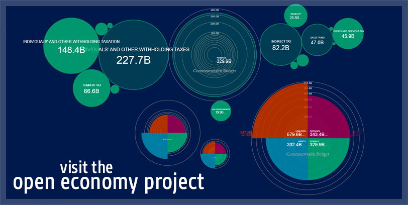
For a year (or three) I’ve been experimenting with visual ways of representing the dry numbers; at scale in financial space and time. The open economy project is the result.
The idea is to place financial entities – from households to corporations to whole countries – on the same canvas. The four-quadrant model is a crude way of representing four key financial indicators: balance sheet on the left, budget on the right, to provide a quick visual comparison between different financial entities. Opening up each in turn, its components can be unfolded, annotated and hyperlinked. It’s a scenario-building tool as well as a map; if you want to see the size of Australia’s wealthiest individuals compared to our entire foreign aid budget, try it out. What do we spend on submarines and what do we spend on homelessness? No problem (actually, big problem). Compare the government’s roads to rail spending? Go on. If you can’t find it, upload and share it.
We’ve started with the 2013-14 budget estimates: the Government’s best-guess as to the budget waters we’re sailing into. For comparison, there are a bunch of corporations and other models – unfold them, roll them back and forward in time and see what they do. In financial space, what does Telstra look like compared to BHP?
What I really hope will happen is that you’ll have a quick look at the formatting guide and start throwing your own models at us in spreadsheet form, and sharing scenarios you’ve made online.
There’s a lot it doesn’t do – there’s no currency inflator, no model for exchange rates, and you can’t search the models (yet). That’s the bad news; the good news is, the code is open source and you are seriously welcome, if you’re so inclined, to get hacking.
Thanks are due principally to Daniel Axtens for taking a set of sketchy images and turning it into a working model while the scope continued to expand as fast as he could cut code. I’m indebted to Elizabeth Proctor, Mark Siford and Claudia Cummins for testing the system and making the models, and to Colin Jacobs, David Paris and Dr Richard Denniss for lending advice and expertise at various times. Specifically, big thanks to the openbudget.org team for doing the heavy lifting of cutting and pasting the budget into a single document: may this be the last time you have to do that.
From the start of this project people have always been intrigued by the idea of a ‘visual budget’- and any project and tool that will increase transparency and literacy with the nations finances and spending priorities is good for democracy. In some places some governments are even doing participatory budgets – heaven forbid. To do that well, you need a better idea of the lie of the land, a better understanding of what is already done in our name and with our taxes.
Remember that the map is not the territory: these are cut and paste models, and although we’ve been careful to identify the source docs, these models are unverified and should be used as illustrations only. They only partially represent a structure that contains its own recursions and abstractions, but a partial map is better than none.
In budget week, irreducible financial complexity collides with the brute simplicity of election-year messaging and political positioning; that’s just how it is. At the very least though, let’s add a dose of legibility to these debates, and a common understanding of the underlying data isn’t a bad place to start.